
What Should I Wear for Family Photos? A Complete Guide to Looking Coordinated Without Matching
Family photos are on the calendar, and now everyone is staring into closets asking the same question: what are we supposed to wear? You want your family to look pulled together in the pictures, but the thought of everyone in identical outfits feels dated and a little forced.
Here is the good news. The secret to great family photos is coordination, not matching. You want your outfits to look like they belong to the same family and the same moment, without everyone wearing the exact same thing. That means choosing a color palette, mixing in gentle variety, dressing for comfort as much as style, and avoiding a few common wardrobe traps. This guide walks you through all of it, so your family looks effortless and timeless.
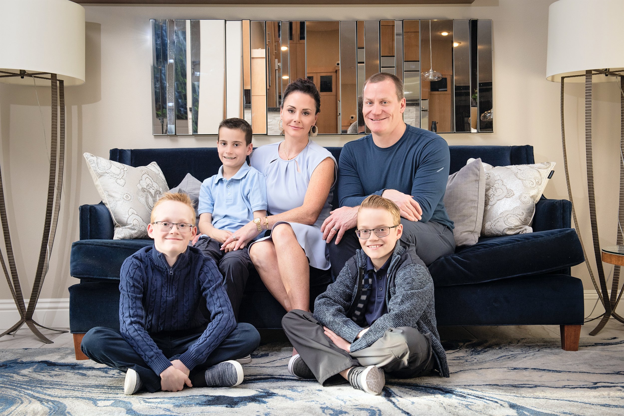
Coordinated, Not Matching: The Golden Rule
The old approach of matching everyone in white shirts and jeans tends to look flat and dated. Coordinating is different and far more flattering. When you coordinate, each person wears something a little different, but the outfits share a palette and a feeling, so the family looks connected without looking like a uniform.
Think of it like a well-decorated room. Nothing is identical, but everything works together. That is exactly the effect you want in a family photo, where the eye moves comfortably across everyone instead of snagging on one outfit that does not fit.
How to Build Your Family Photo Color Palette
Start with a palette of two or three main colors, plus a neutral or two. This is the single most useful thing you can do, because once you have a palette, every outfit decision gets easier.
A simple approach that always works:
Pick one anchor color you love, ideally something that suits everyone
Add one or two complementary colors that sit near it or balance it
Layer in neutrals like cream, tan, soft gray, denim, or olive to tie everything together
Let each family member wear the palette in a slightly different way
Soft, muted, and earthy tones tend to photograph beautifully and stay timeless, while very bright neon shades can reflect onto skin and pull attention. When in doubt, choose colors you would be happy to see hanging on your wall for years, because that is exactly where these photos are meant to end up.
Patterns, Textures, and What to Avoid
You do not have to stick to solids, but patterns work best in moderation. A single patterned piece, like a floral dress or a subtle plaid, can anchor the whole group, while the others wear solids that pull colors from that pattern. If more than one person wears a bold pattern, the outfits can start to compete.
Texture is your secret weapon. Knits, denim, linen, lace, corduroy, and layers add richness and depth without adding visual noise, which keeps the family looking coordinated while still feeling interesting. A few things tend to work against you:
Large logos or graphics that date the photo and pull the eye
Several loud patterns competing in the same frame
Neon colors that reflect onto faces
All black or all white with nothing to add depth
Brand-new stiff clothing no one has worn or moved in yet
Dressing the Kids Without the Meltdown
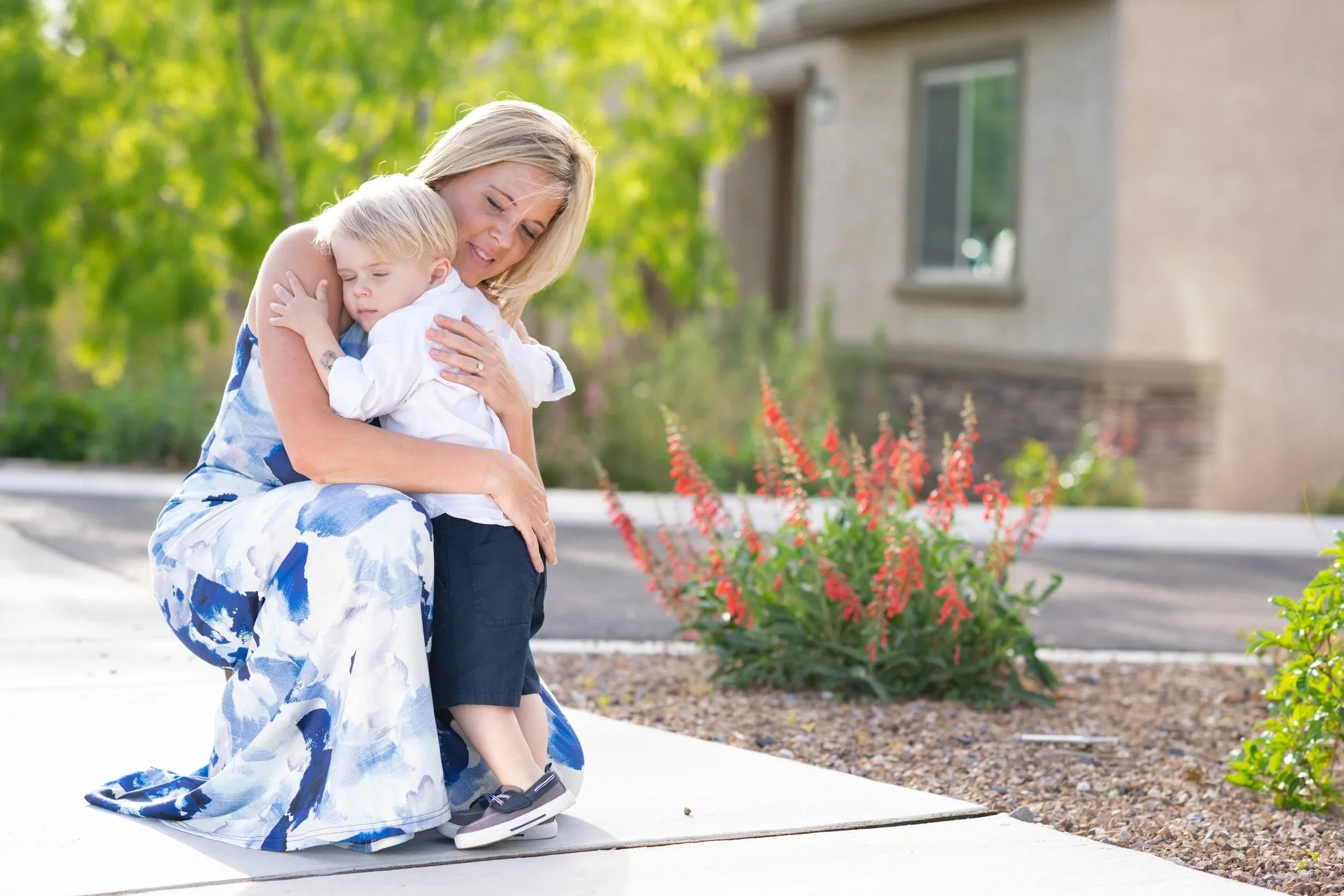
Kids photograph best when they feel like themselves and, above all, when they are comfortable. A beautiful outfit is worthless if your child is tugging at a stiff collar the entire session. Choose pieces within your palette that they can move, sit, and play in.
A few tips that save the day:
Let older kids help choose within your palette, so they feel good about what they are wearing
Avoid brand-new shoes and anything scratchy or tight
Bring a small backup outfit in case of spills
Keep accessories simple, since kids tend to fuss with them
Dress them a notch dressier than everyday, but never so formal they feel like a costume
Studio vs. Outdoor Wardrobe
Where you shoot changes what works. In a studio, especially with dramatic, intentional lighting, richer and deeper tones often look striking against a clean backdrop, and you have full control over the light regardless of season or weather. Outdoors, softer and earthier tones tend to blend naturally with the surroundings.
If you are shooting in a Las Vegas or Henderson studio, you can lean into a more polished, elevated palette, since the controlled lighting lets those colors shine. Whichever setting you choose, the coordination principles stay the same. Palette first, gentle variety, comfort always.
Accessories, Shoes, and the Finishing Touches
Once your outfits are set, the small details pull everything together. Accessories add personality and depth, but the goal is to enhance the look, not distract from it. A few simple guidelines keep the finishing touches working for you:
Choose accessories that complement your palette rather than compete with it
Keep jewelry and extras simple, especially for children who tend to fidget
Coordinate shoes on purpose, since they almost always show in full-length photos
Add gentle texture through scarves, hats, layers, or a jacket for visual interest
Make sure everything is comfortable, so no one is adjusting or fussing during the session
The finishing touches are also where each person's individuality can shine. Within a shared palette, a favorite jacket, a special necklace, or a signature color lets everyone feel like themselves while still belonging to the group.
Coordinating Larger and Multi-Generational Families
Coordinating outfits gets a little more involved when grandparents, cousins, and multiple households are in the frame, but the same principles scale up beautifully. The key is to agree on one shared palette for everyone, then let each smaller family unit interpret it in their own way.
A few tips make large-group coordination painless:
Send the whole group the same palette, ideally with a simple visual example
Let each household coordinate within that palette rather than assigning exact outfits
Spread colors around the group so people wearing the same shade are not all standing together
Keep patterns minimal, since they multiply quickly in a big group
Lean on neutrals, which give the eye places to rest in a full frame
When everyone pulls from one palette, even a large family looks unified and intentional rather than busy, and the final portrait feels like it truly belongs together.
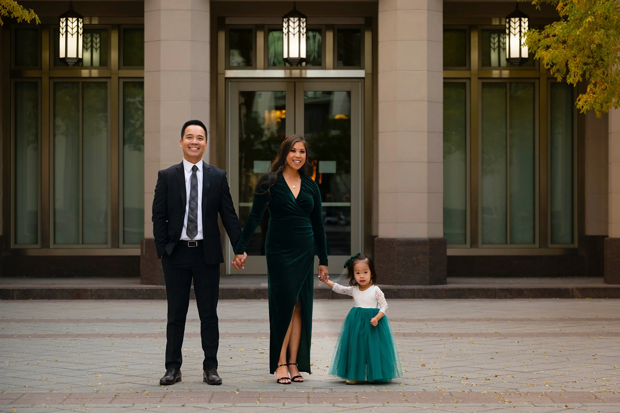
A Simple Step-by-Step Plan for Family Photo Outfits
If all of this feels like a lot, here is a simple sequence that takes the guesswork out of planning:
Step 1: Choose your palette. Pick two or three main colors plus a neutral or two, ideally shades that suit everyone and match the space where the photos will hang.
Step 2: Start with the hardest person to dress. Usually a teenager or a partner with strong opinions. Build the rest of the outfits around what works for them.
Step 3: Add gentle variety. Vary tones, textures, and styles within the palette so no two outfits are identical, but everything still belongs together.
Step 4: Layer in one pattern, if any. Let a single patterned piece anchor the group, then pull solid colors from that pattern for everyone else.
Step 5: Try everything on together. Lay the outfits side by side, or better yet, have everyone try them on in the same room. This is the fastest way to spot a color or piece that clashes.
Step 6: Prioritize comfort. Do a final check that everyone can move, sit, and breathe easily, because comfort is what lets real smiles show up.
Follow those six steps and you will walk into your session confident that your family looks coordinated, natural, and ready for photos worth framing.
The Night Before Your Session
A little preparation the night before makes the day of your session calm instead of chaotic. A quick list to run through:
Lay out every outfit completely, including shoes, layers, and accessories
Steam or press everything so wrinkles do not show up in the photos
Charge and pack anything you are bringing, from backup outfits to snacks for the kids
Confirm the time and location, and plan to arrive a few minutes early
Get a good night's sleep, since rested faces photograph beautifully
Handle these the night before, and you walk in relaxed and ready, which is exactly the mood that shows up in great family photos.
Beyond the Photoshoot: Turning Portraits Into Art
Here is something worth thinking about before the session even happens. Family portraits are not meant to live forever on a phone or a forgotten USB drive. They are meant to be printed, displayed, and enjoyed every day.
There is real value in that. According to research summarized by Frameology, displaying family photos in the home can strengthen children's sense of identity and belonging, and printed photos tend to carry more emotional weight than images that stay on a screen. When you plan your wardrobe with a palette that suits your home, you are not just dressing for a photo. You are creating artwork you will actually want to hang.
So as you plan, picture the finished portrait on your wall. Choose colors that feel like your family and your space, and those images become something your family sees, and feels, every single day. For more planning tips, browse our blog.
Frequently Asked Questions
Does everyone have to wear the same color?
No. In fact, matching exactly tends to look dated. Choose a palette of two or three colors plus neutrals, and let each person wear it a little differently. The goal is coordinated, not identical.
Can we wear patterns in family photos?
Yes, in moderation. One patterned piece can anchor the group while everyone else wears solids drawn from that pattern. Avoid multiple bold patterns competing in the same photo.
What should kids wear for family pictures?
Comfortable pieces within your color palette that they can move and play in. Skip stiff, brand-new, or scratchy clothing, and let older kids have a say so they feel confident on the day.
What colors photograph best?
Soft, muted, and earthy tones tend to look timeless and flattering. In a studio with dramatic lighting, richer and deeper tones can look striking. Very bright neon colors can reflect onto skin and are best avoided.
What should we avoid wearing for family photos?
Large logos, several competing patterns, neon shades, all black or all white with no texture, and stiff brand-new clothing. These tend to distract from faces and date the images.
How many outfits should each person bring?
One planned outfit is enough for most sessions, with an optional backup for kids in case of spills. If you want variety, coordinate a second palette-friendly look, but there is no need to overpack.
What should we wear for studio family photos?
In a studio with dramatic, controlled lighting, richer and deeper tones often look striking against a clean backdrop. Stick to your coordinated palette, prioritize comfort, and avoid neon shades and large logos.
Let's Plan Your Family Session
Beautiful family photos start long before the shutter clicks. With the right palette and a plan, your family looks effortless, coordinated, and timeless, and you walk away with artwork you will love for years.